> ## Documentation Index
> Fetch the complete documentation index at: https://docs.attio.com/llms.txt
> Use this file to discover all available pages before exploring further.
#
> A button component.
```js theme={"system"}
import {Button} from "attio/client"
```
Where a button renders depends on the surface. On [pages](../pages/overview) and [record tabs](../extensions/record-tab) it renders inline, wherever it sits in the component tree. In [dialogs](../dialogs/show-dialog) it is lifted out of the tree and placed in the dialog footer. A button inside a [``](./table#table-cell) is the exception: it stays in the cell.
## Example
```jsx theme={"system"}
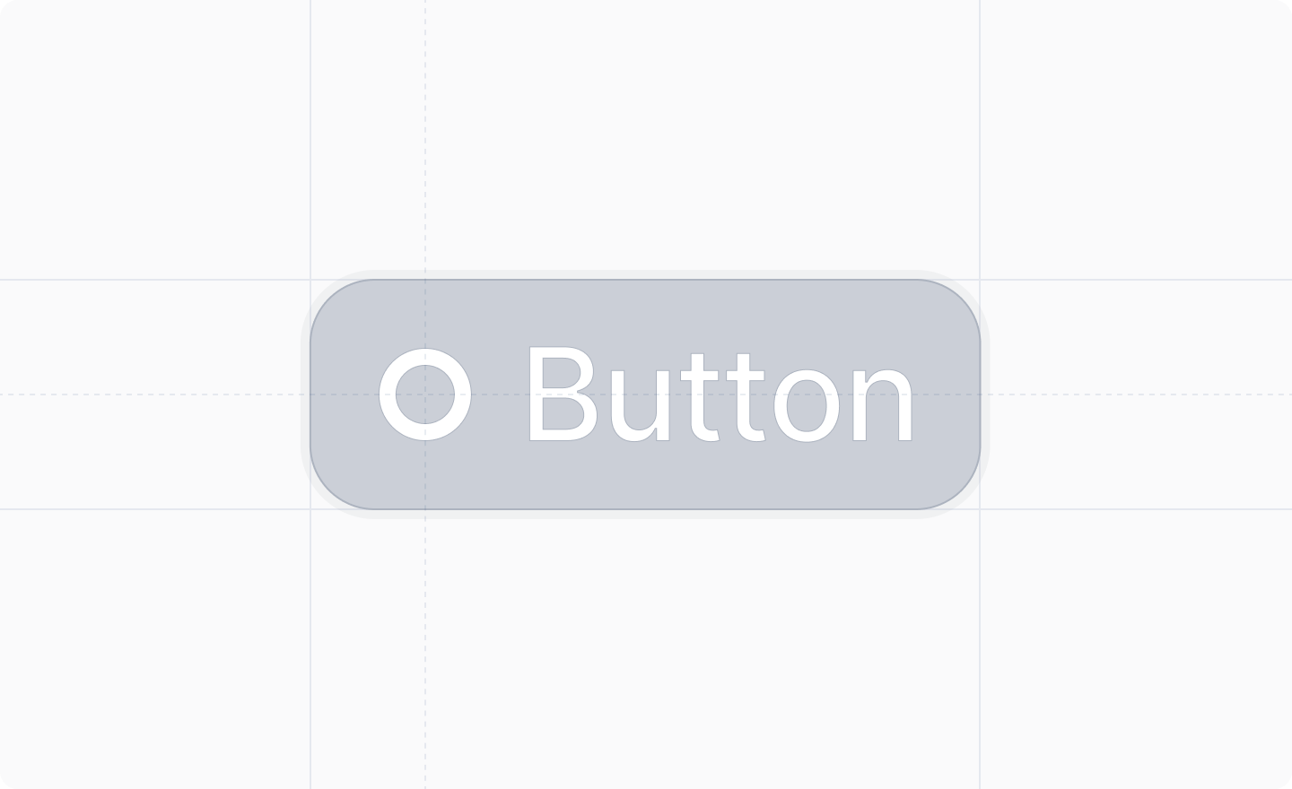
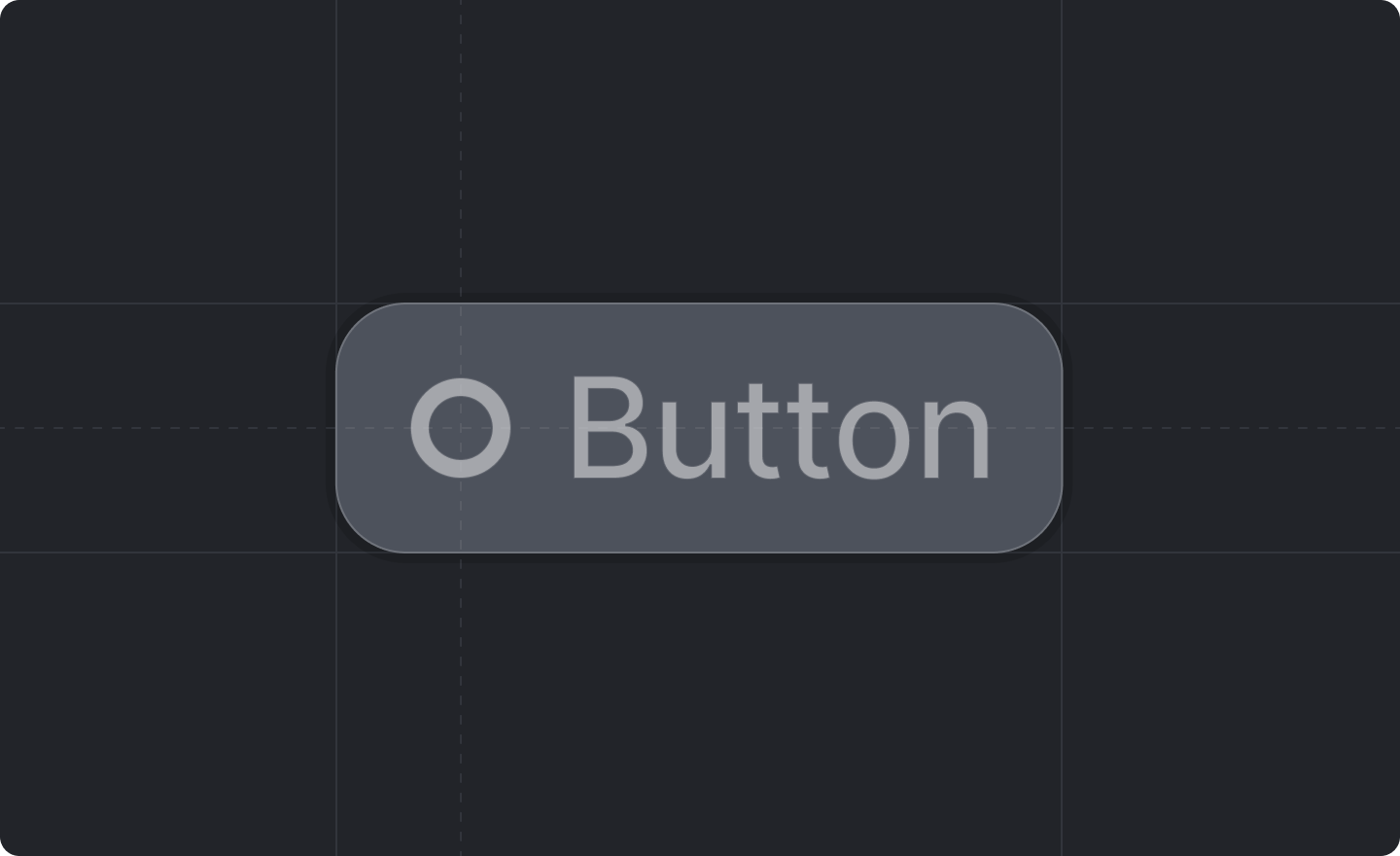 ```js theme={"system"}
import {Button} from "attio/client"
```
Where a button renders depends on the surface. On [pages](../pages/overview) and [record tabs](../extensions/record-tab) it renders inline, wherever it sits in the component tree. In [dialogs](../dialogs/show-dialog) it is lifted out of the tree and placed in the dialog footer. A button inside a [`
```js theme={"system"}
import {Button} from "attio/client"
```
Where a button renders depends on the surface. On [pages](../pages/overview) and [record tabs](../extensions/record-tab) it renders inline, wherever it sits in the component tree. In [dialogs](../dialogs/show-dialog) it is lifted out of the tree and placed in the dialog footer. A button inside a [`